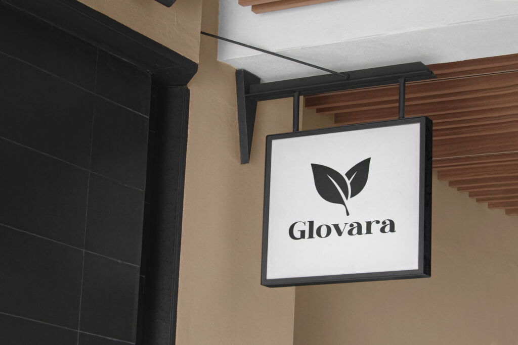
Kinematrix Digital has unveiled the new logo for Glovara, a soap brand that is set to make waves in the personal care industry. The logo, which features a pair of fresh green leaves against a soft, muted background, perfectly encapsulates the brand's commitment to natural ingredients and environmentally friendly practices.
The Design Concept
The choice of green leaves in the logo is symbolic, representing nature, freshness, and purity—qualities that Glovara strives to embody in its products. The leaves are designed in a simple yet elegant style, reflecting the brand's minimalist approach to skincare. This design choice underscores Glovara's dedication to providing clean, uncomplicated products that are free from harmful chemicals and unnecessary additives.
The color palette of the logo is carefully chosen to convey a sense of calm and trust. The soft green leaves set against a neutral background evoke a feeling of serenity, aligning with the brand’s message of natural harmony and well-being. This color scheme is not only aesthetically pleasing but also serves to differentiate Glovara from more vibrant, aggressive branding often seen in the soap market.
Typography and Brand Identity
The typography used for the brand name "Glovara" is classic and refined, further enhancing the brand’s image of sophistication and reliability. The font is bold yet graceful, with a slight curve that adds a touch of warmth and approachability. This balance of strength and elegance in the typography mirrors the dual focus of the brand: effective skincare solutions that are gentle on both the skin and the environment.
The Message Behind the Logo
Glovara’s new logo is more than just a visual identifier; it’s a statement of the brand’s values and mission. The integration of natural elements into the logo design highlights Glovara’s commitment to sustainability and environmental responsibility. As consumers become increasingly aware of the impact of their purchasing choices, Glovara positions itself as a brand that not only cares for its customers but also for the planet.
In an industry where visual branding plays a critical role in consumer perception, Kinematrix Digital has successfully crafted a logo that communicates Glovara’s core principles: purity, simplicity, and sustainability. The logo is a promise to consumers that when they choose Glovara, they are choosing a product that is gentle on their skin and kind to the environment.
Conclusion
As Glovara prepares to launch its range of soaps, the brand’s new logo sets the stage for a successful entry into the market. With its clear focus on natural beauty and eco-consciousness, Glovara is poised to become a trusted name in personal care. The logo designed by Kinematrix Digital will undoubtedly play a key role in building brand recognition and loyalty, making it an essential asset as Glovara embarks on its journey to redefine the standards of skincare.
Whether you're a consumer looking for gentle, eco-friendly soap options or a design enthusiast interested in the latest trends in branding, Glovara’s logo is a perfect example of how thoughtful design can effectively communicate a brand's ethos. Keep an eye out for Glovara as it makes its debut—it’s a brand that promises to make a lasting impact, both visually and ethically.


